STYLEGUIDE AND DESIGN SYSTEM
STYLEGUIDE AND DESIGN SYSTEM
Youtap limited
Role
Role
Role
UX / UI designer
UX researcher
UX / UI designer
UX researcher
UX / UI designer
UX researcher
Skills
Skills
Skills
Early concept
Wireframing
Prototyping
User Testing
Early concept
Wireframing
Prototyping
User Testing
Early concept
Wireframing
Prototyping
User Testing
Team
Team
Team
UX/UI Designer
Project manager
Developer
Developer
UX/UI Designer
Project manager
Developer
Developer
UX/UI Designer
Project manager
Developer
Developer
Timeline
Timeline
Timeline
6 months
6 months
8 Months
My role
My role
My role
Strategies and execution of the design system involved working with designers and developers to align and update our workflows, as well as writing the design documentation.
Strategies and execution of the design system involved working with designers and developers to align and update our workflows, as well as writing the design documentation.
Strategies and execution of the design system involved working with designers and developers to align and update our workflows, as well as writing the design documentation.


From 1 weeks to 10 mins of reskin
From 1
weeks to
10 mins of reskin
From 2 weeks to
10 mins of reskin
From 1 weeks to 10 mins of reskin
Faster client onboarding
Faster client onboarding
700+
Published
UI elements
700+
Published
UI elements
700+
Published
UI elements
700+
Published
UI elements
Tokenisation
Tokenisation
Tokenisation
Common language
Faster implement
Improved communication
Common language
Faster implement
Improved communication
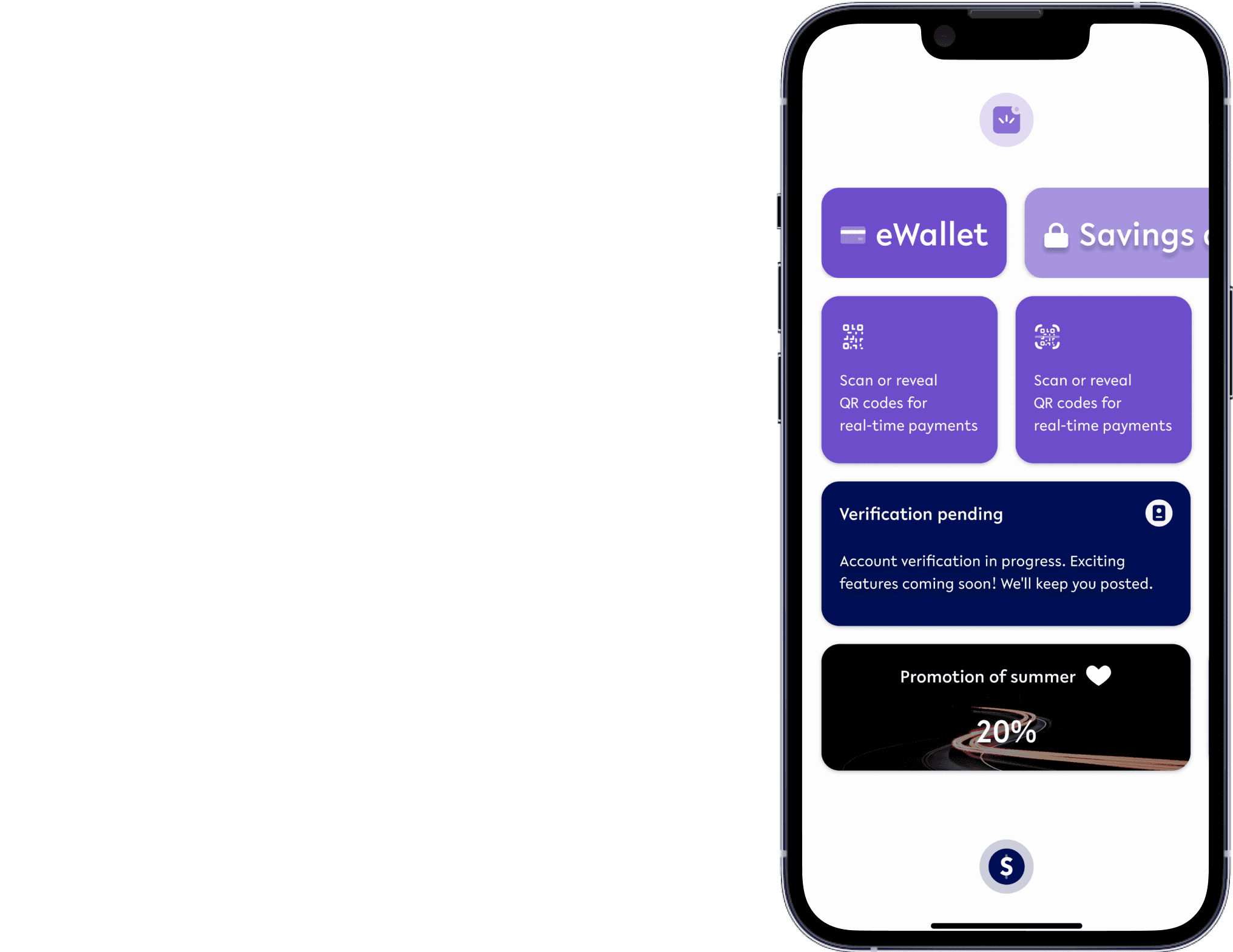
Youtap is a fintech company, providing white label product to banks and financial service providers.White label product reduces the time for clients to provide consumer application to their users with hast rebranding and customisation.


What is a White Label Product?
This is the selling point of Youtap. We design and build optimised payment applications, and with a regular fee, each of our clients receives their version of the application for iOS and Android, which can be configured and controlled by CMS. It saves the cost and time required for clients to develop their applications.
PROBLEM STATMENT
PROBLEM STATMENT
Addressing the
elephant in the room
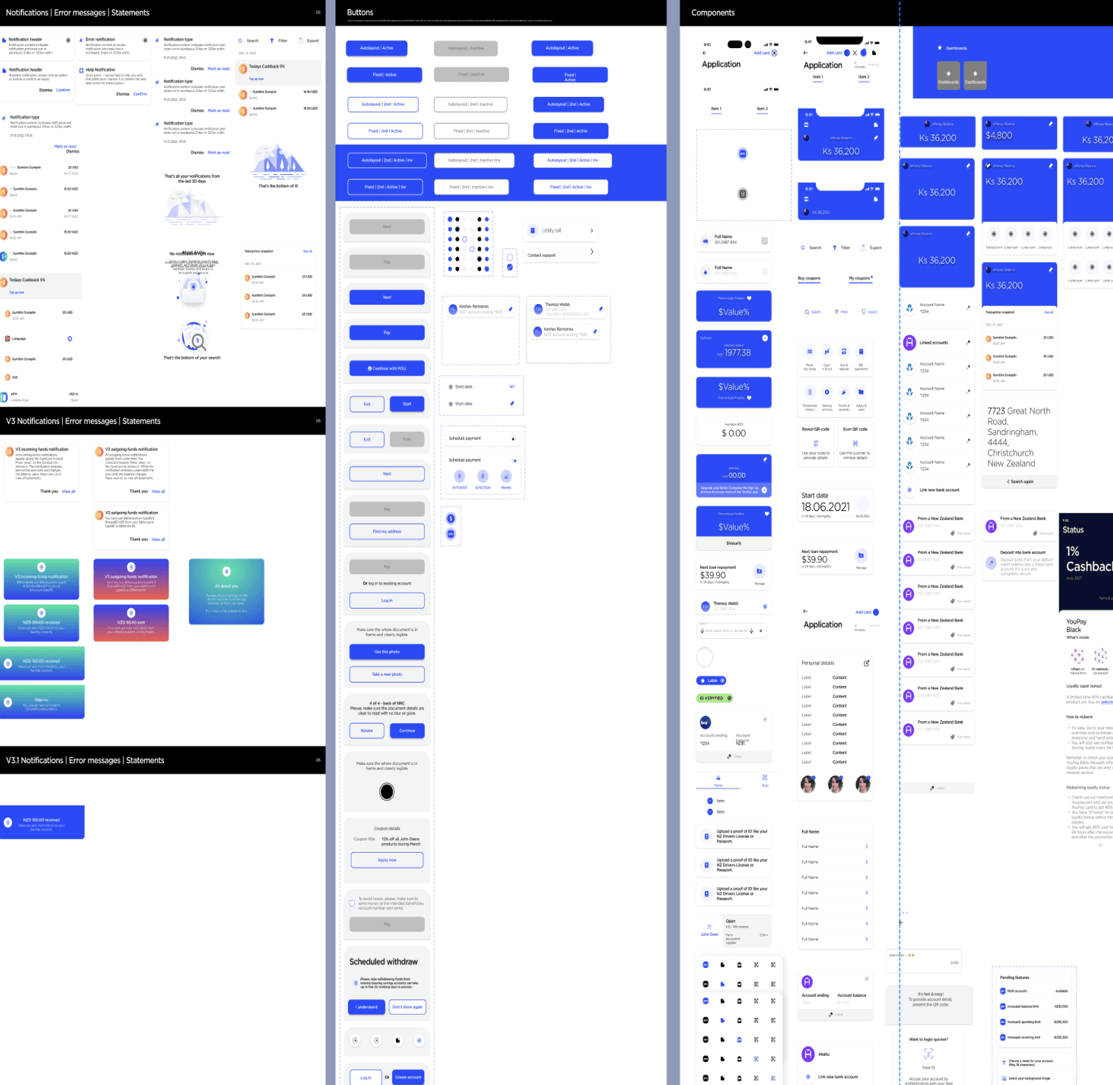
It was clear due to the smaller team of the startup, there was a lack of time allocation to manage and maintain the design files. Different rebranded flavours showed inconsistency as well as incomplete components and style-guide. We had raised the issue to the teams and worked on improvement to be scalable.
What are the causes?
Problem 1
Disorganised file structure with non-component elements, making layer and element functions unclear.
File contained element which were not part of component library as well as disorderly layer structure. I found it difficult to understand the purpose of the layers as well as the function of the element.
Problem 2
Components are too general. It limits customisation and feature expansions.
Lack of dynamic component library has limited customisation and found difficulty in expansion of design features of the white label application.
Problem 3
Missing design documentation caused misaligned communication with the team.
As the design system was not up to date, the latest design artifacts were not informed to the developer and project manager.




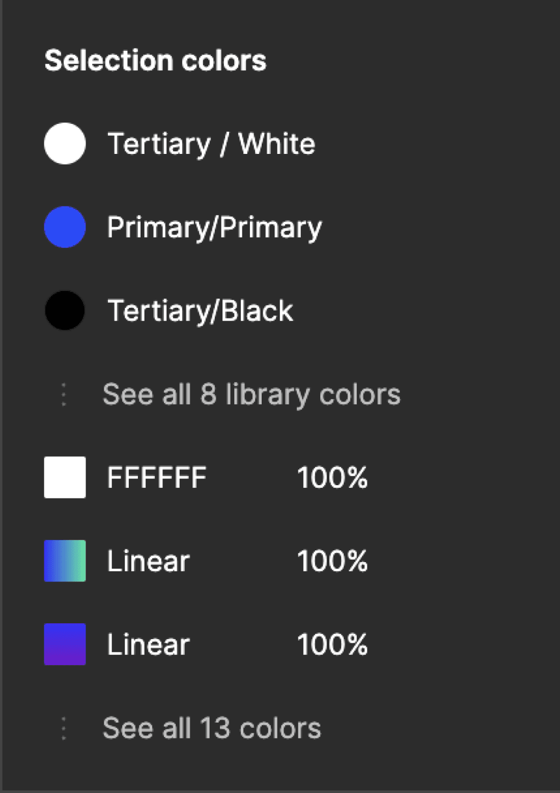
Then let’s think about what WE need ultimately
Then let’s think about what WE need ultimately
‘SCALABILITY’
‘SCALABILITY’
‘SCALABILITY’
At Youtap, the startup environment and focus on white-label products required a design system designed for scalability. To support a growing team of designers and developers, we refined the system by implementing atomic design principles and tokenisation, ensuring it was both flexible and robust for future growth.
At Youtap, the startup environment and focus on white-label products required a design system designed for scalability. To support a growing team of designers and developers, we refined the system by implementing atomic design principles and tokenisation, ensuring it was both flexible and robust for future growth.
Due to the nature of startup and white labeling product, it is clear there is always goal to scale. Ultimately the design system will be utilised by bigger team of designer and developers. In order to achieve such, we had to refine design system to be scalable by implementing atomic design principle and tokenisation.
COMPETITIVE ANALYSIS
COMPETITIVE ANALYSIS
How are the competitors implementing their design systems?
What makes the design system scalable?
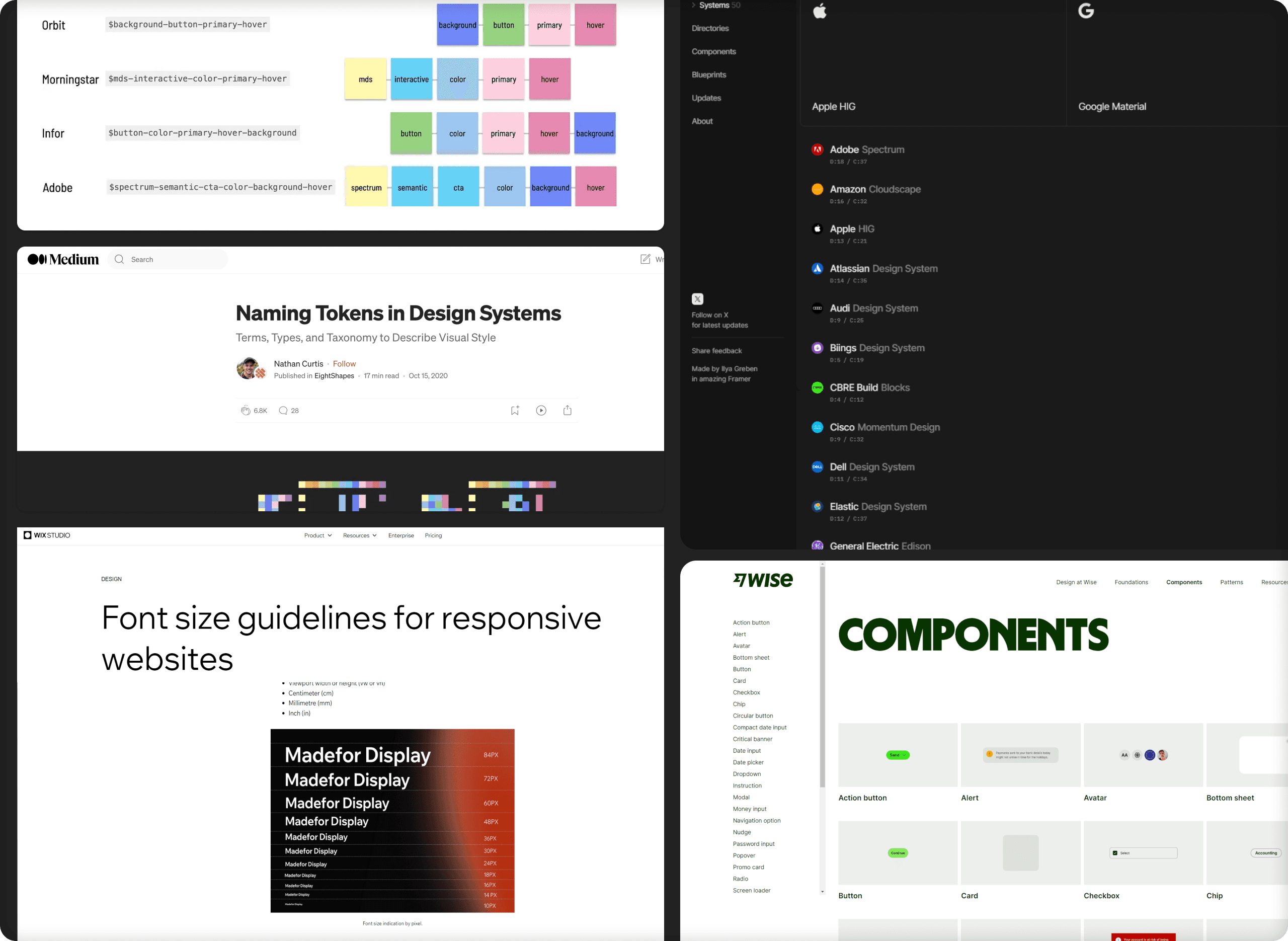
Research on public design systems to find the best practice to make the design scalable:
Wix, Wise, and other leading companies design systems via designsystem.surf
Guidelines on tokenisation of public design system.
MEDIUM publication article on design systems and tokenisation
So what is design system and what is required to make our product scalable?
Public design system
Wix, Wise, other leading companies design system via designsystem.surf
Guidelines on tokenisation of public design system.
Medium publication article on design system and tokenisation


APPROACH AND DECISION MAKING
APPROACH AND DECISION MAKING
Setting the foundation before the restructure
Setting the foundation before the restructure
Setting the foundation before the restructure
Taking further steps will cause more issues, let’s refactor and reinforce
Taking further steps will cause more issues, let’s refactor and reinforce
When I joined the team, it was clear that the design files were in poor condition, making it difficult to onboard new clients or customise effectively for existing ones.
Despite supporting three clients for reskinning, the design system lacked a proper library of components and styles. Issues of incompleteness and inconsistency needed to be addressed to ensure the design files could be efficiently managed and scaled for each client.
Over six months, while balancing other responsibilities, we undertook a comprehensive refactoring process. Key areas we standardised included:
Styles
Spacing and Padding
Typography
UI Componentisation
Instances and variables help reduce number of screen to manage
Instances and variables help reduce number of screen to manage
We decided to map the architecture of the consumer application, which helped identify inefficient flows. We discovered screens that were unnecessary and could be consolidated into a single, reusable page template. While this required investments in a new set of UI components, it was a deliberate decision to enhance both the product and the overall consumer experience.
We decided to map the architecture of the consumer application, which helped identify inefficient flows. We discovered screens that were unnecessary and could be consolidated into a single, reusable page template. While this required investments in a new set of UI components, it was a deliberate decision to enhance both the product and the overall consumer experience.
Deleted
34 unused UI
Deleted
34 unused UI
Identified unused components
as filter process
85 published to 700+ UI elements
85 published to 700+ UI elements
Zero custom components utilised in design file
Zero custom components
utilised in design file
Instant change update via style
Instant change update via style
Significant improvement in update process of UI
Significant improvement in
update process of UI
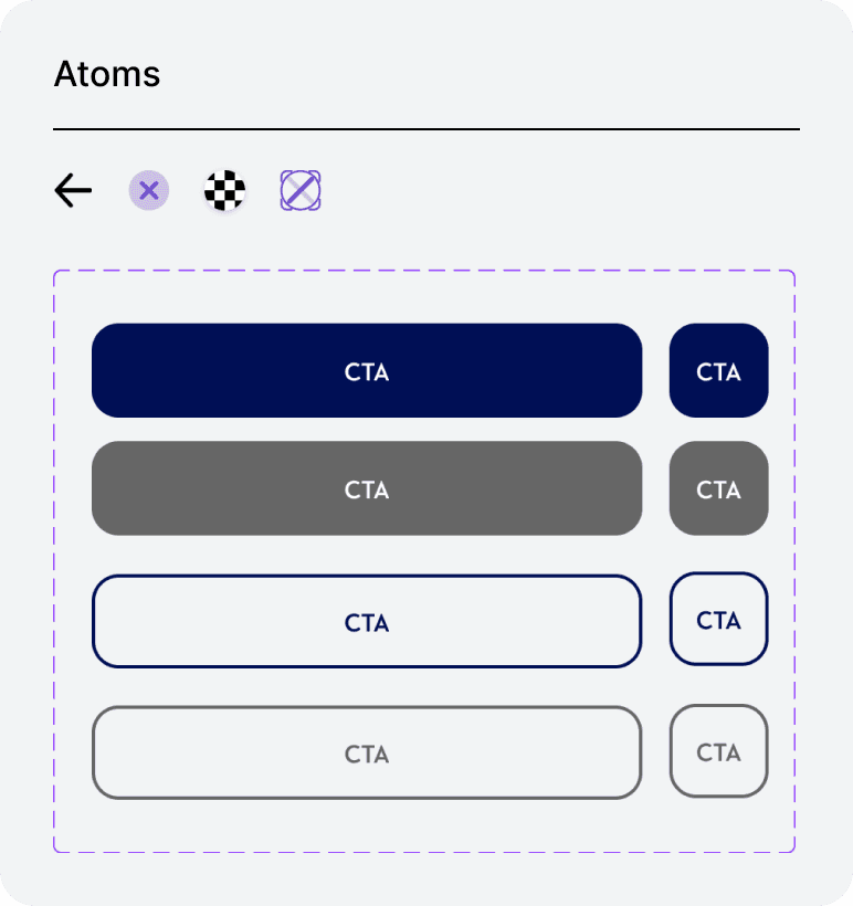
Applying Atomic Principle
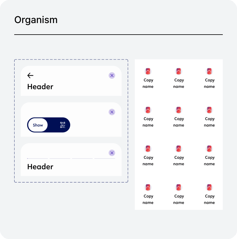
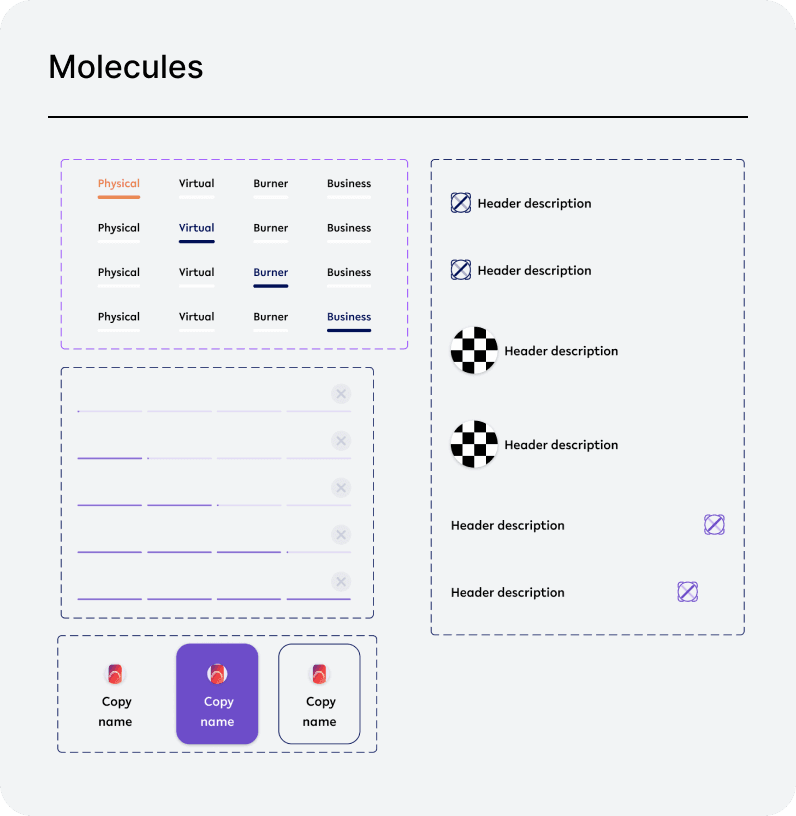
Before my contribution to the company, the style guide had attempts of atomic principlea, which was a long way from completion. I have re-tackled the refactor starting from the very fundamental atomic level and working our way organism level.
Before my contribution to the company, the style guide had attempts of atomic principlea, which was a long way from completion. I have re-tackled the refactor starting from the very fundamental atomic level and working our way organism level.
Before my contribution to the company, the style guide had attempts of atomic principlea, which was a long way from completion. I have re-tackled the refactor starting from the very fundamental atomic level and working our way organism level.
Key insights
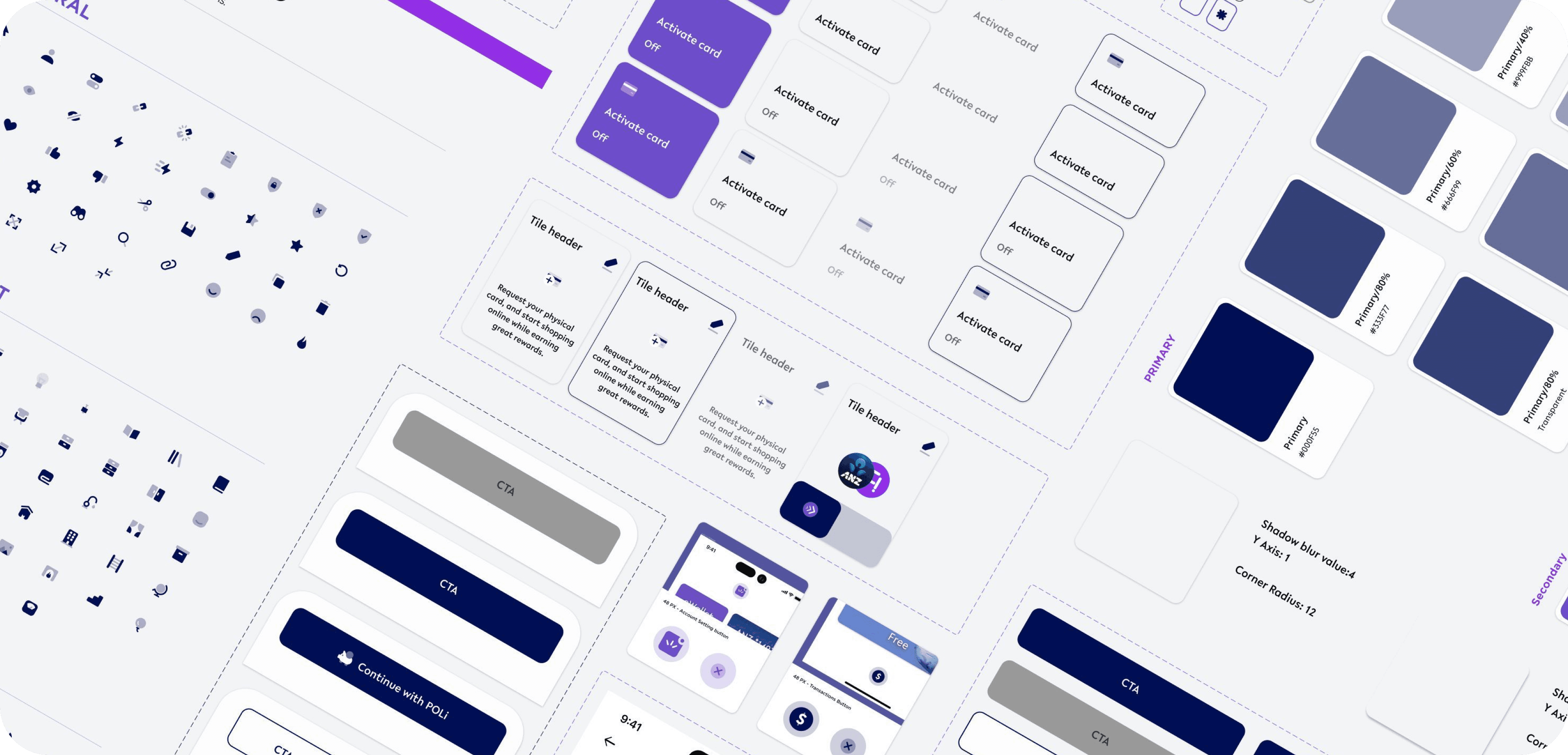
The focus was on creating a nested system that could adapt to different use cases while also allowing for the seamless expansion of new UI components when needed. This approach ensured that the white-label product remained highly configurable, enabling it to cater to each client's unique scope of features effectively.
The focus was on creating a nested system that could adapt to different use cases while also allowing for the seamless expansion of new UI components when needed. This approach ensured that the white-label product remained highly configurable, enabling it to cater to each client's unique scope of features effectively.
Here are samples
Here are samples






GOING THE EXTRA STEP - FUTURE PROOFING
GOING THE EXTRA STEP - FUTURE PROOFING
Tokenisation & Variables
Tokenisation & Variables
Variables
Variables
Based on insights gained from our research, we initiated the conversion of colours, dimensions, text styles, corner radius, and shadows into variables. This laid the foundation for components and layouts to be systematically tokenised, enabling greater consistency and flexibility in design.
Based on the learning from the research, we have initated to convert colour, dimensions, text style, corner radius, and shadow into variables. These created foundation for components and layout for tokenisation
Based on insights gained from our research, we initiated the conversion of colours, dimensions, text styles, corner radius, and shadows into variables. This laid the foundation for components and layouts to be systematically tokenised, enabling greater consistency and flexibility in design.
Creating the system
ONE FOR ALL
Variable control panel
Creating the system
ONE FOR ALL
Variable control panel
Creating system.
ONE FOR ALL
Variable control panel
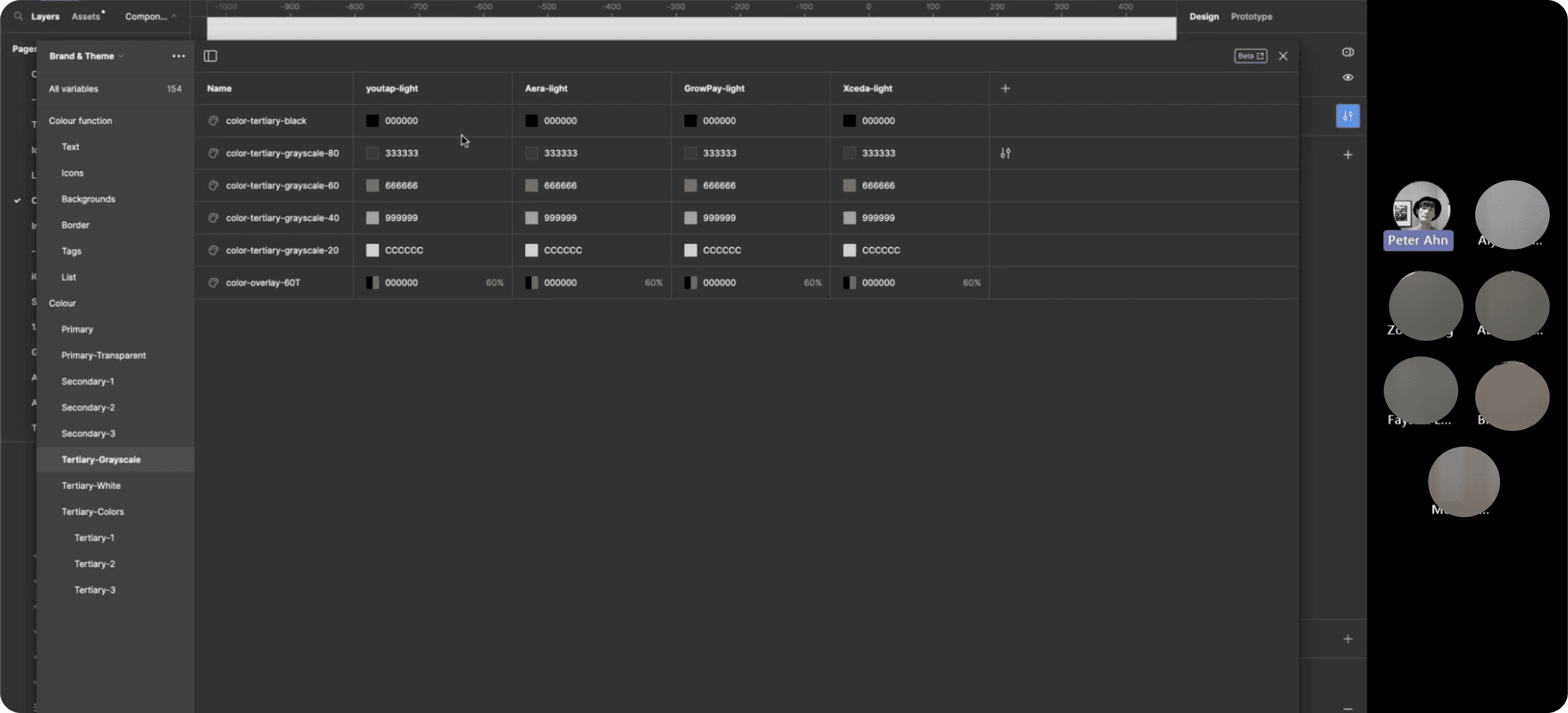
The variables replacing traditional styles were created using Figma’s local variable feature.
Initially, we converted base styles such asz colours and numerical values into variables.
Through an iterative process of trial and error, we developed functional variables, which represent specific applications of these base variables. Functional variables are nested within the base variables, making them both configurable and adaptable.
Combining base and functional variables forms a mode, which acts as a predefined configuration. This setup functions like a control panel, enabling seamless management of variable configurations across all client implementations.
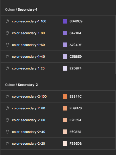
Base variables
Base style, spacing, gap, other numerical value with generic naming convention which contains specification detail.
Base style, spacing, gap, other numerical value with generic naming convention which contains specification detail.
Base style, spacing, gap, other numerical value with generic naming convention which contains specification detail.

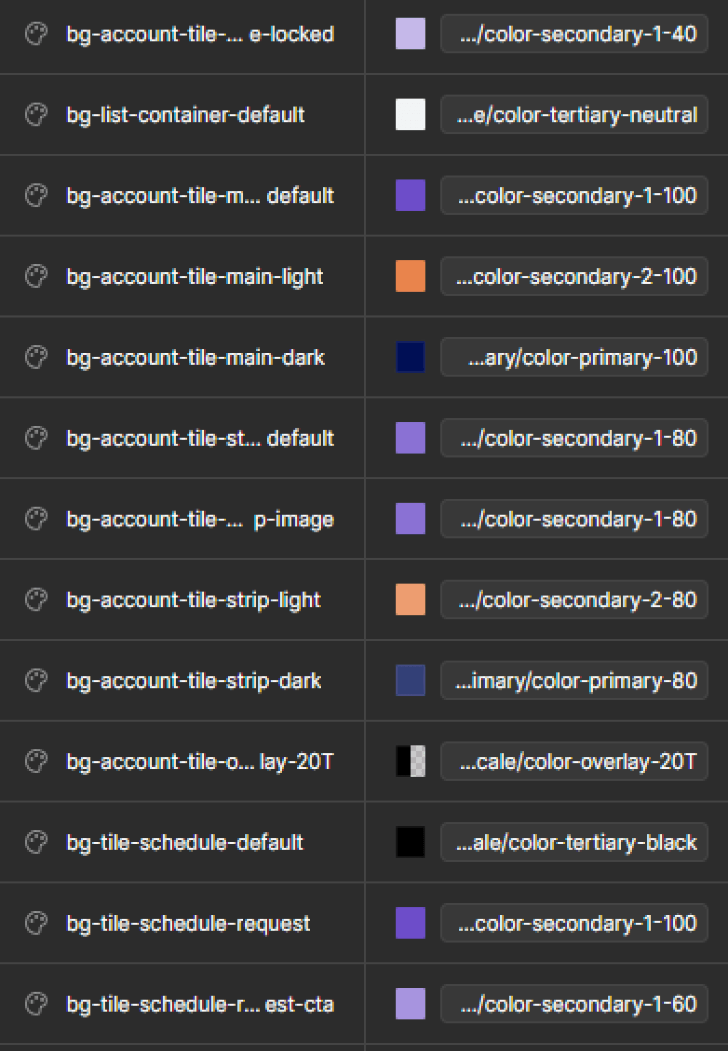
Functional variables
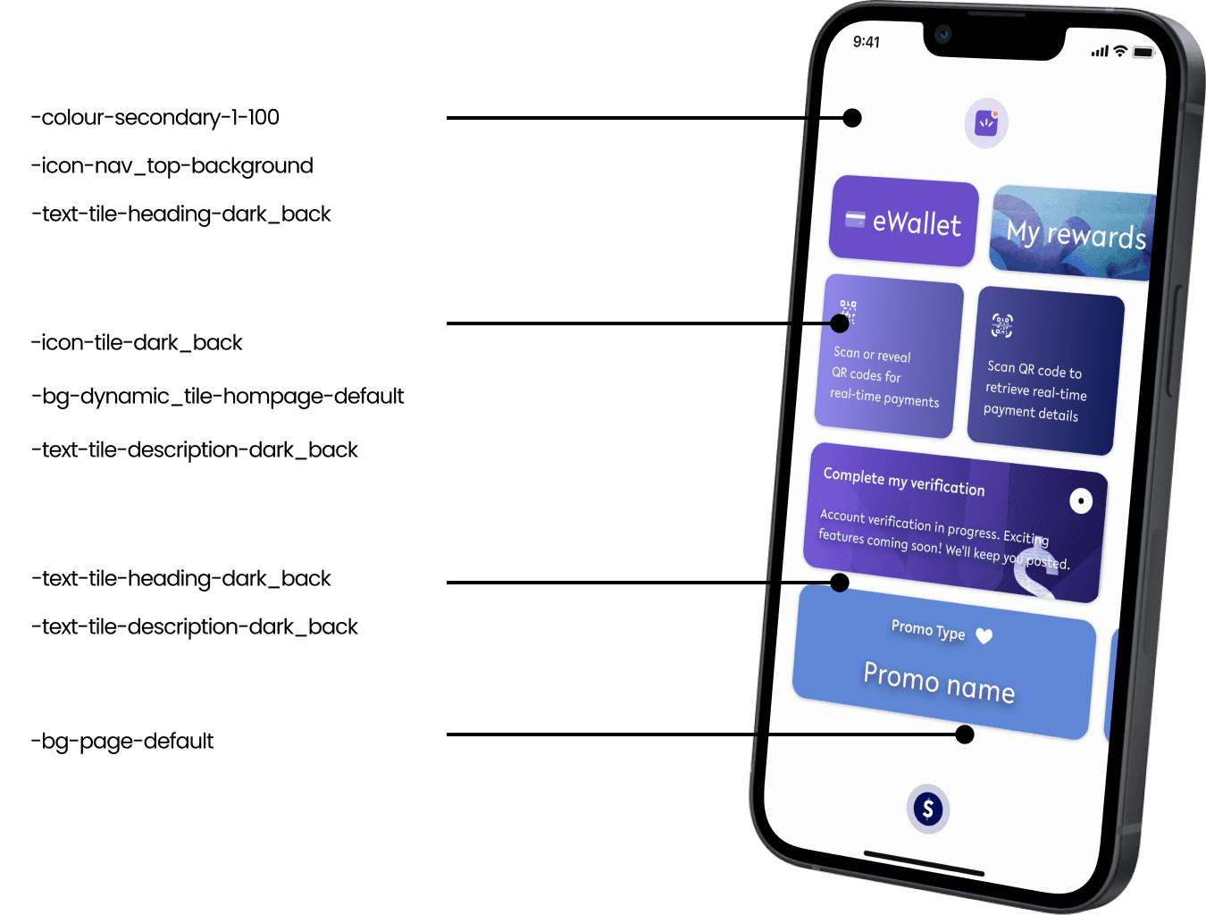
Variables with specific functionality following the naming system of
’Property-Element-Variant-State’.
Variables with specific functionality following the naming system of
’Property-Element-Variant-State’.

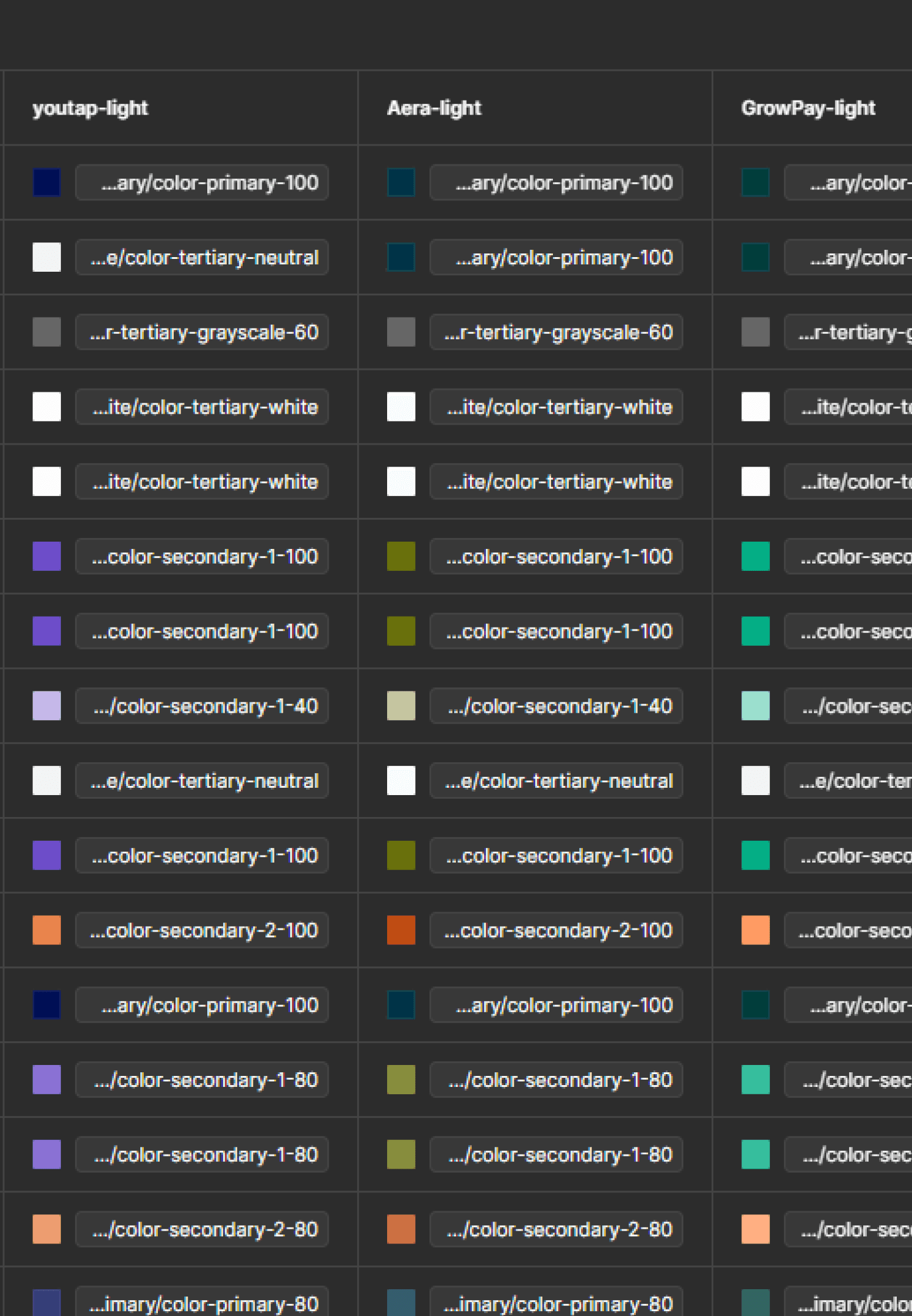
Modes
Once all base and functional variables are set up. They are to be duplicated as different modes as re-skin process.
Once all base and functional variables are set up. They are to be duplicated as different modes as re-skin process.




Tokenisation
Tokenisation
Tokenised naming system has been explored via number of sessions with developers to discuss and receive insight to find the most optimal naming convention which we agreed upon
Tokenised naming system has been explored via number of sessions with developers to discuss and receive insight to find the most optimal naming convention which we agreed upon
Tokenised naming system has been explored via number of sessions with developers to discuss and receive insight to find the most optimal naming convention which we agreed upon
Property
Property
Property
Element
Element
Element
Variant
Variant
Variant
Status
Status
Status
“bg - List - container - default”
“bg - List - container - default”


Created series workshops to present our variable tokenisation system and collectively with the developers
Created series workshops to present our variable tokenisation system and collectively with the developers




FINALISING
Design system - documentation
Design system - documentation
Design system - documentation
Single source of truth
Single source of truth
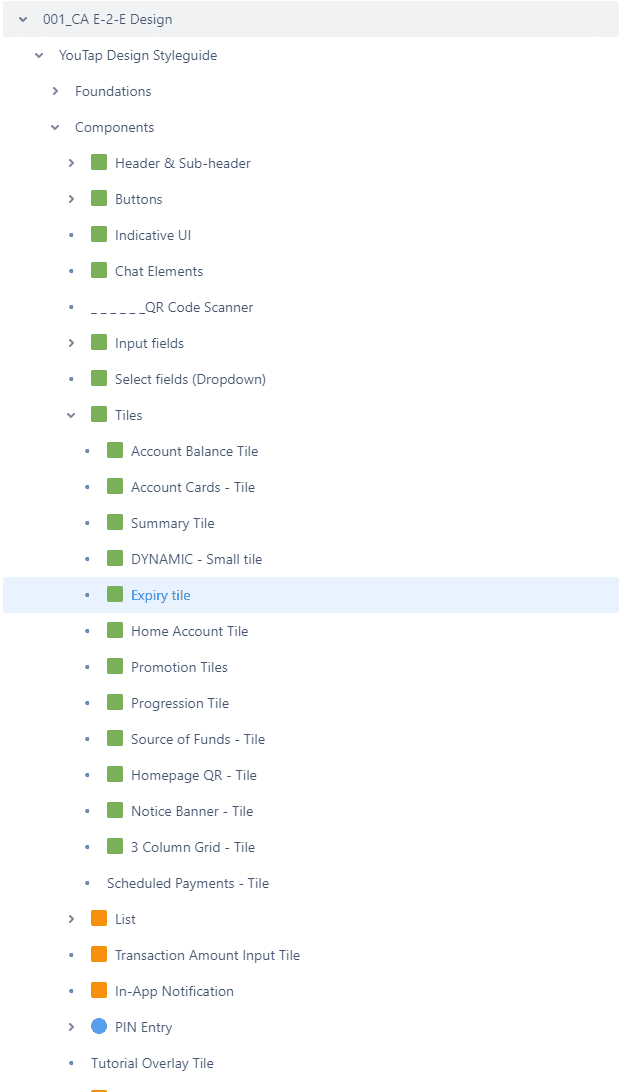
Atlassian Confluence is used to document every design system material for all teams as well as future onboarding staff to reference.
We have documented
Acceptance criteria
Use Case
Specification
Interaction Behaviour
Animation
Accessibility (WCG standard)
Resource links such as Figma directory.
By documenting full content, communication with other teams has significantly improved.
It has reduced time spent on back-and-forth discussions, and eliminated contact by the developers significantly as the required information was up-to-date and informative enough.
We have used Atlassian Confluence to document every design system material for all teams as well as future onboarding staff to reference to.
We have documented
Acceptance Crtieria
Use Case
Specification
Interaction Behavior
Animation
Accessibility (WCG standard)
Resource links such as Figma directory.
By documenting full content, communication to other team has significantly improved.
It has reduced time spent on going back and eliminated contact from developers significantly as required information were helpful enough.
Atlassian Confluence is used to document every design system material for all teams as well as future onboarding staff to reference.
We have documented
Acceptance criteria
Use Case
Specification
Interaction Behaviour
Animation
Accessibility (WCG standard)
Resource links such as Figma directory.
By documenting full content, communication with other teams has significantly improved.
It has reduced time spent on back-and-forth discussions, and eliminated contact by the developers significantly as the required information was up-to-date and informative enough.


IMPACTS
As a result we have achieved
As a result we have achieved
As a result we have achieved
Standardise our components and common language across all teams and platforms.
Standardise our components and common language across all teams and platforms.


Decrease the rebranding process from 1 weeks to 10 minutes process.
Decrease the rebranding process from 1 weeks to 10 minutes process.

One central style-guide file to manage all rebranding
One central style-guide file to manage all rebranding

Eliminated conflict of development builds via standardising configuration.
Eliminated conflict of development builds via standardising configuration.
